Somewhat like Hurricane Michael, the stock market selloff last week seemed to come out of nowhere quickly, and it hit hard.
The question on everyone’s mind is what caused the sharp move? In truth, nobody really knows the answer, but that also means that my guess can’t be wrong.
There are several broad themes that could explain the selloff, including further weakening of US relations with China expressed in the current trade skirmish, potentially weaker relations with Saudi Arabia after the suspicious death of a journalist, caution about ‘peak’ profit margins that could spell an earnings slowdown, and momentum selling by hedge funds.
All of those are reasonable explanations that could be contributors, but in my humble opinion, I think the biggest factor is rising interest rates. I think last week was a repeat of what we saw in February when stocks sold off as yield in the 10-year rose (although, just as it’s the case today, there were a lot of other things going on too).
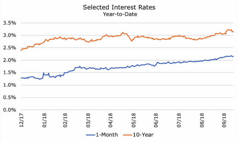
The chart below shows the yield on the one-month Treasury bill (in blue) compared to the 10-year Treasury note (in orange). You can see that both yields have increased this year.
Looking at the chart this way, though, doesn’t really convey the dramatic shifts in my opinion, so I want to show you two more charts that I think illustrate just how much rates have changes in the first 10 months of this year.
The first one is the ‘spread’ between these two rates, which in bond lingo just means the difference between the two rates.
I like this chart because it illustrates that interest rates aren’t monolithic – different maturities along the yield curve change by different levels that affect the ‘shape’ of the yield curve.
The curve can be ‘steep,’ which means that there is a large difference between short and long-term rates, it can be ‘flat,’ which means the different is small, or it can be ‘inverted,’ which means that short-term rates are higher than longer-term rates.
The chart above shows that the shape of the curve has shifted a lot this year, but despite two or three big periods of steepening, it’s mostly flatter. A lot of investors have wondered whether the curve might invert at some point in the near future, which would be a bad since it usually signals a recession.
In that regard, the rising spread that you can see since August is good news, because it could signal that the risk of recession is shrinking.
That seems contradictory, though, because if the risk of recession is shrinking, then stocks ought to be going higher, not selling off.
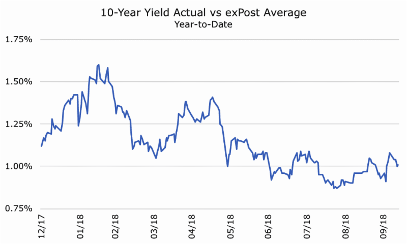
I think the third chart may illuminate what investors may be worried about:

This chart shows yield on the 10-year so far this year (in blue) compared to the average rate on the 10-year so far this year (in black). Obviously, on day one, it would have been impossible to know what the average would be, and it will continue to change as we get more data.
The point of showing the yield this way is to see the degree and speed of change from the average, which you can really see in January and August (and in April, although there was a sharp reversal). I think investors during both periods were worried by the sharp change in yield.
For several years, the 3.0 percent has served as an unofficial ceiling on the 10-year note. Every time it would reach or modestly breach that level, it fell back down again. Last week, it shot to 3.23 percent, which served as a jolt to investors.
The good news about higher rates is that it signals that investors are more optimistic about economic growth and, therefore, the likelihood of higher inflation. There are some signs of inflation, but we are just now at the Federal Reserve target rate of two percent for the first time in years.
The bad news about higher rates is that it will increase borrowing costs for companies and consumers. I don’t want to get too wonky here, but higher interest rates also affect how many stock investors value stocks, and to make a long story short, higher rates means lower valuations to a large group of investors.
Let’s say you agree with my hypothesis (along with many others) that higher rates are responsible for the selloff in stocks. The question is, what should you do about it? My answer is always the same: make sure that you’re comfortable with your asset mix between stocks and bonds.
This time, it’s a little harder because both stocks and bonds are falling, which doesn’t make either one particularly enticing. While stocks and bonds usually have a modest positive correlation, they do fall together from time to time (bonus material alert: I’ll send more information on this tomorrow).
Still, though, despite the rockiness in both asset classes, our financial planning models have accounted for these market environments. The software doesn’t attempt to predict them or explain them after the fact, but simply acknowledge that selloffs happen so that we can build a financial plan that will meet your goals WITH the bad times included.
Unlike with a hurricane, I’m advocating ‘riding it out’ instead of evacuating.
