I haven’t seen or read much about it, but this is a very tough time for value investors. In fact, to my surprise, it hasn’t been this bad for value investors since the late 1990s tech bubble.
Although you can find the same thing if you look at commercial indexes from companies like S&P, Russell and MSCI, the following data from academic Ken French tells the whole story. While useful, French’s data does require some explanation.
When academics look at strategies like value, momentum, etc., they create long/short portfolios to pull out the impact of the overall market. By simply looking at how small caps compare to large caps in a long/short context (long small and short large), you can ignore what the broad market is doing and simply focus on how the strategy is faring.
I like the academics and think that this is a smart approach, but I don’t love their naming conventions because they are too complicated. For example, they refer to value as HmL, which stands for ‘high price-to-book minus low-price-to-book,’ which just means long cheap stocks and short expensive stocks. Small cap, is SmB, or ‘small minus big’ referring to market capitalization.
Whatever they call it, the following table shows the results for Value and Size for various periods ending on September 30th (it takes a few weeks for the academics to update their data).
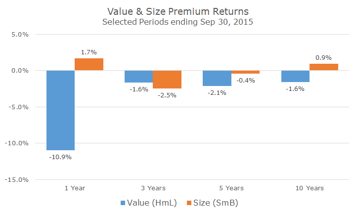
You can see that value stocks were just crushed over the last year – down 10 percent compared to growth stocks (again, ignoring the overall market return). That’s bad enough to drag down the three, five and 10-year numbers into negative territory.
To put those numbers into perspective, the one year results are in the 9th percentile of all rolling one-year returns since the data begins in 1926. That means that there are 1060 one-year periods since the beginning of the data (Jan to Jan, Feb to Feb, etc.) and the one that ended in September ranks 962.
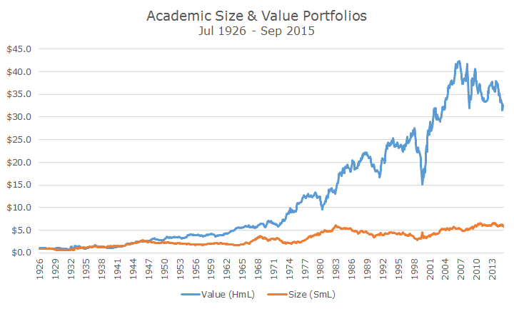
The 10 year numbers are worse: of the 957 10-year rolling periods, only five are worse than this one and you guessed it, those were all in the tech bubble. The chart below shows what a dollar invested in HmL would have looked like since 1926 (I threw size in there too for comparison sake).
Does that mean that we are in a bubble now? I don’t think so. Stocks are expensive, but we’re not in a bubble. I do think, though, that like the late 1990s where technology stocks drove growth stocks much higher, one sector is mostly to blame again: this time it’s energy.
In the 12 months that ended on September 30th, the S&P 500 Energy Index lost -29.68 percent compared to the -0.62 percent return for the S&P 500.
Value indexes and funds tend to overweight energy stocks because they are almost always cheap compared to the overall market. Energy stocks tend to be very cyclical and have boom and bust periods (like right now).
Markets know this about these stocks and don’t pay as much for them even in the good times, which makes them relatively cheap compared to other sectors. Over the last decade, the median price-to-book ratio for the S&P 500 Energy index was 1.96 and was 2.41 for the S&P 500, reflecting a discount of 20 percent to the overall market.
I’m not saying that energy is the only culprit, but it is one of the bigger pieces to the puzzle. At the end of the quarter, energy stocks were as cheap as they were in the 2008 financial crisis, on a price-to-book basis. The S&P 500 Energy index rose 11.25 percent last month and was up another 2.44 percent yesterday which should make HmL look a little better when the data comes out later this month.
In the meantime, though, it’s always useful to remember that strategies like size, value, momentum, etc. have additional risks. We think that the extra returns are worth the extra risk in the long run, but sometimes the short run can be tough to get through, which is why we diversify among the strategies in the first place.

- David Ott
- David Ott
- David Ott
- David Ott
- David Ott
- David Ott
- David Ott
- David Ott
- David Ott
- David Ott
- David Ott
- David Ott
- David Ott
- David Ott
- David Ott
- David Ott
- David Ott
- David Ott
- David Ott
- David Ott
- David Ott
- David Ott
- David Ott
- David Ott
- David Ott
- David Ott
- David Ott
- David Ott
- David Ott
- David Ott
- David Ott
- David Ott
- David Ott
- David Ott
- David Ott
- David Ott
- David Ott
- David Ott
- David Ott
- David Ott
- David Ott
- David Ott
- David Ott
- David Ott
- David Ott
- David Ott
- David Ott
- David Ott
- David Ott
- David Ott
- David Ott
- David Ott
- David Ott
- David Ott
- David Ott
- David Ott
- David Ott
- David Ott
- David Ott
- David Ott
- David Ott
- David Ott
- David Ott
- David Ott
- David Ott
- David Ott
- David Ott
- David Ott
- David Ott
- David Ott
- David Ott
- David Ott
- David Ott
- David Ott
- David Ott
- David Ott
- David Ott
- David Ott
- David Ott
- David Ott
- David Ott
- David Ott
- David Ott
- David Ott
- David Ott
- David Ott
- David Ott
- David Ott
- David Ott
- David Ott
- David Ott
- David Ott
- David Ott
- David Ott
- David Ott
- David Ott
- David Ott
- David Ott
- David Ott
- David Ott
- David Ott
- David Ott
- David Ott
- David Ott
- David Ott
- David Ott
- David Ott
- David Ott
- David Ott
- David Ott
- David Ott
- David Ott
- David Ott
- David Ott
- David Ott
- David Ott
- David Ott
- David Ott
- David Ott
- David Ott
- David Ott
- David Ott
- David Ott
- David Ott
- David Ott
- David Ott
- David Ott
- David Ott
- David Ott
- David Ott
- David Ott
- David Ott
- David Ott
- David Ott
- David Ott
- David Ott
- David Ott
- David Ott
- David Ott
- David Ott
- David Ott
- David Ott
- David Ott
- David Ott
- David Ott
- David Ott
- David Ott
- David Ott
- David Ott
- David Ott
- David Ott
- David Ott
- David Ott
- David Ott
- David Ott
- David Ott
- David Ott
- David Ott
- David Ott
- David Ott
- David Ott
- David Ott
- David Ott
- David Ott
- David Ott
- David Ott
- David Ott
- David Ott
- David Ott
- David Ott
- David Ott
- David Ott
- David Ott
- David Ott
- David Ott
- David Ott
- David Ott
- David Ott
- David Ott
- David Ott
- David Ott
- David Ott
- David Ott
- David Ott
- David Ott
- David Ott
- David Ott
- David Ott
- David Ott
- David Ott
- David Ott
- David Ott
- David Ott
- David Ott
- David Ott
- David Ott
- David Ott
- David Ott
- David Ott
- David Ott
- David Ott
- David Ott
- David Ott
- David Ott
- David Ott
- David Ott
- David Ott
- David Ott
- David Ott
- David Ott
- David Ott
- David Ott
- David Ott
- David Ott
- David Ott
- David Ott
- David Ott
- David Ott
- David Ott
- David Ott
- David Ott
- David Ott
- David Ott
- David Ott
- David Ott
- David Ott
- David Ott
- David Ott
- David Ott
- David Ott
- David Ott
- David Ott
- David Ott
- David Ott
- David Ott
- David Ott
- David Ott
- David Ott
- David Ott
- David Ott
- David Ott
- David Ott
- David Ott
- David Ott
- David Ott
- David Ott
- David Ott
- David Ott
- David Ott
- David Ott
- David Ott
- David Ott
- David Ott
- David Ott
- David Ott
- David Ott
- David Ott
- David Ott
- David Ott
- David Ott
- David Ott
- David Ott
- David Ott
- David Ott
- David Ott
- David Ott
- David Ott
- David Ott
- David Ott
- David Ott
- David Ott
- David Ott
- David Ott
- David Ott
- David Ott
- David Ott
- David Ott
- David Ott
- David Ott
- David Ott
- David Ott
- David Ott
- David Ott
- David Ott
- David Ott
- David Ott
- David Ott
- David Ott
- David Ott
- David Ott
- David Ott
- David Ott
- David Ott
- David Ott
- David Ott
- David Ott
- David Ott
- David Ott
- David Ott
- David Ott
- David Ott
- David Ott
- David Ott
- David Ott
- David Ott
- David Ott
- David Ott
- David Ott
- David Ott
- David Ott
- David Ott
- David Ott
- David Ott
- David Ott
- David Ott
- David Ott
- David Ott
- David Ott
- David Ott
- David Ott
- David Ott
- David Ott
- David Ott
- David Ott
- David Ott
- David Ott
- David Ott
- David Ott
- David Ott
- David Ott
- David Ott
- David Ott
- David Ott
- David Ott
- David Ott
- David Ott
- David Ott
- David Ott
- David Ott
- David Ott
- David Ott
- David Ott
- David Ott
- David Ott
- David Ott
- David Ott
- David Ott
- David Ott
- David Ott
- David Ott
- David Ott
- David Ott
- David Ott
- David Ott
- David Ott
- David Ott
- David Ott
- David Ott
- David Ott
- David Ott
- David Ott
- David Ott
- David Ott
- David Ott
- David Ott
- David Ott
- David Ott
- David Ott
- David Ott
- David Ott
- David Ott
- David Ott
- David Ott
- David Ott
- David Ott
- David Ott
- David Ott
- David Ott
- David Ott
- David Ott
- David Ott
- David Ott
- David Ott
- David Ott
- David Ott
- David Ott
- David Ott
- David Ott
- David Ott
- David Ott
- David Ott
- David Ott
- David Ott
- David Ott
- David Ott
- David Ott
- David Ott
- David Ott
- David Ott
- David Ott
- David Ott
- David Ott
- David Ott
- David Ott
- David Ott
- David Ott
- David Ott
- David Ott
- David Ott
- David Ott
- David Ott
- David Ott
- David Ott
- David Ott
- David Ott
- David Ott
- David Ott
- David Ott
- David Ott
- David Ott
- David Ott
- David Ott
- David Ott
- David Ott
- David Ott
- David Ott
- David Ott
- David Ott
- David Ott
- David Ott
- David Ott
- David Ott
- David Ott
- David Ott
- David Ott
- David Ott
- David Ott
- David Ott
- David Ott
- David Ott
- David Ott
- David Ott
- David Ott
- David Ott
- David Ott
- David Ott
- David Ott
- David Ott
- David Ott
- David Ott
- David Ott
- David Ott
- David Ott
- David Ott
- David Ott
- David Ott
- David Ott
- David Ott
- David Ott
- David Ott
- David Ott
- David Ott
- David Ott
- David Ott
- David Ott
- David Ott
- David Ott
- David Ott
- David Ott
- David Ott
- David Ott
- David Ott
- David Ott
- David Ott
- David Ott
- David Ott
- David Ott
- David Ott
- David Ott
- David Ott
- David Ott
- David Ott
- David Ott
- David Ott
- David Ott
- David Ott
- David Ott
- David Ott
- David Ott
- David Ott
- David Ott
- David Ott
- David Ott
- David Ott
- David Ott
- David Ott
- David Ott
- David Ott