Over the years, we’ve seen and created a ‘periodic table’ of returns that stacks asset classes in order of their performance on a year by year basis. By color coding each asset class, most investors look at the table and realized that asset classes jump around a lot and it’s difficult, if not impossible, to make good timing decisions.
I thought it would be interesting to the same thing with bond returns, using data from Barclays and Citigroup (all of the indexes are Barclays except for the two global government indexes).
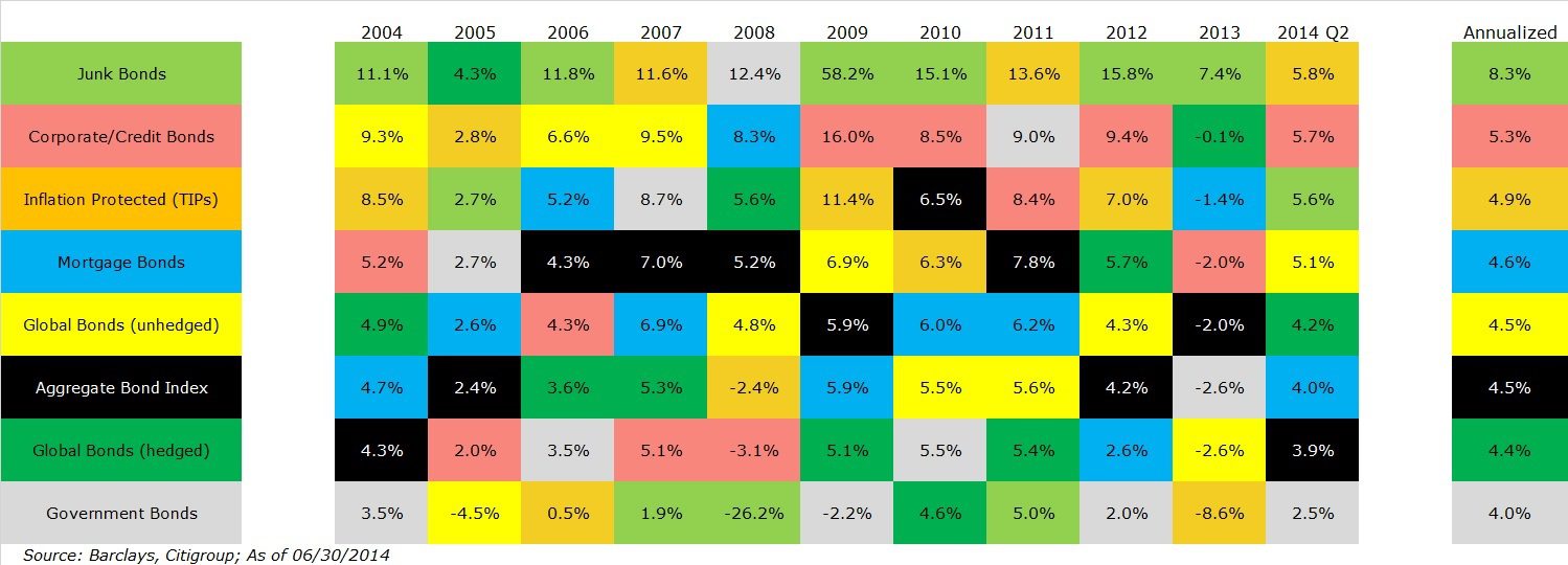
The key on the left is ordered to match the annualized return for each asset class, which can be seen at the far right. For example, junk bonds had the best returns at 8.3 percent annually, so they are the top of the list. Conversely, US government bonds had the lowest return at 4.0 percent, so they fall to the bottom of the list.
Looking at the annualized returns, they are almost exactly what you would expect them to be: the bonds with the least risk, US government bonds, have the lowest returns. Non-US bonds, which are hedged to US dollars, have slightly more risk and, therefore, more return.
To earn more than five percent per year, during this period, you needed to take credit risk – the risk that your interest and principal won’t be paid back, partially or in full. Investment grade bonds are colored red in this table and earned 1.3 percent more than government bonds, slightly more than the long-term average difference.
The big winner over the last decade were junk bonds, which are corporate bonds that are non-investment grade, as determined by bond rating agencies like Moody’s and S&P. The long-term difference between government bonds and junk bonds has averaged ~2.8 or so, which means that this 10.5 year period was much better than average with a spread of 4.3 percent.
One things that these periodic tables shows is that returns can be volatile. Take a look at the return for junk bonds in 2008 during the financial crisis, they lost -26.2 percent. They recovered everything that was lost during 2009 and have been on a real tear since then.
You can also get a sense of the correlation between assets by looking at these tables. Generally speaking, when junk bonds were having their best years, government bonds were at the bottom of the table. When junk bonds were getting crushed, government bonds saved the day. These two assets are actually negatively correlated when you look at the data.
We write a lot about the Barclays Aggregate Bond index, which is comprised of the corporate/credit, government and mortgages indexes (a few other things, but these three sectors account for the vast majority of the holdings).
It shouldn’t be a surprise, then, that the more diversified index is generally around the middle. It’s never the worst or the best.
When we first formed Acropolis, more than 90 percent of the assets were held in mortgages and governments. As you can see, mortgages and governments aren’t bad (far from it!), but there are other opportunities worth pursuing.
We first added TIPs in 2007, which has worked out well, and have exposure to everything on this list except for junk bonds (our exposure to unhedged global bonds is extremely small, but it’s there). We believe that the diversification benefits are high and there is no sacrifice to returns.
This picture may not be worth a thousand words, but there are dozens of interesting insights.

David is a trusted advisor to 50 families, delivering comprehensive financial solutions, including financial planning, investment management, cash management, tax planning, estate planning, and charitable giving. As Chief Investment Officer, he leads the Investment Committee and the research and trading team. His team continuously evaluates investment strategies and securities, working closely with Portfolio Managers to implement them effectively.