I’ve written about recessions a half dozen times this year, probably because it’s obvious to everyone that the risk of a recession is very high.
A recession is not certain, and a handful of economists think we can avoid it (including the Federal Reserve staff economists, apparently), but I think common sense dictates that a recession is likely.
Last week, the yield on the 10-year note was less than the yield on a three-month Treasury bill, which has historically been a good indication that a recession is coming.
I saw the economist who first discovered the relationship between the inverted yield curve and recessions on YouTube, and he pointed out that the recession typically follows the yield inversion by 12-18 months and the inversion has to last more than a quarter to be relevant (so one day last week isn’t enough).
When the recession actually comes, how long it might last or how deep it might cut are separate, unanswerable questions.
Despite all of the recession uncertainty, I saw an interesting (and heartening) chart and have recreated it below.
The chart shows how $1 invested at the start of a recession historically grew over the following two years. You can see a lot of squiggles below, which represent those returns. The red line is simply the average of all of the individual recessions.
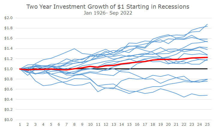
The average return for an investor who put $1 in the S&P 500 at the outset of each US recession would have enjoyed an annualized return of 12.0 percent for the next two years – a much better result than I would have expected.
That doesn’t mean that there aren’t some doozies – there are. The worst outcome is $1 invested in 1929, and it’s only worth 48 cents after two years. Then there are three results where the return was -20 to -25 percent or so, which happened in 1937, 2001, and 2008.
But most of the results are pretty good, and a lot are fantastic. The best return was in 1953, when a $1 investment grew to $1.88. The next best was in the roaring 1920s when $1 grew to $1.84.
Now, as I highlighted earlier this month (which you can read by clicking here), the worst returns aren’t in recessions; they are before recessions. The returns in recessions are less than the overall average, but the returns after recessions are pretty strong.
By starting after the worst returns are over and then including some of the post-recession recoveries, the chart looks pretty good.
That said, two years isn’t all that long in the scheme of things, which helps illustrate that recessions end, and most of the time, stocks recover relatively quickly.
