Bond yields continued their downward march and fell to a five-week low yesterday as the yield on the 10-year US Treasury hit 1.73 percent. After starting the year at 2.24 percent, the benchmark yield dropped to 1.63 percent when the stock market bottomed out on February 11th and then climbed to 1.98 percent before falling again.
As low as your yields are today, they are among the highest in the developed world, as the chart below shows. The chart includes the G7 countries (with the benchmark eurozone rate representing Germany, France and Italy), Switzerland and Australia (each representing the highest and lowest rates in the developed world).
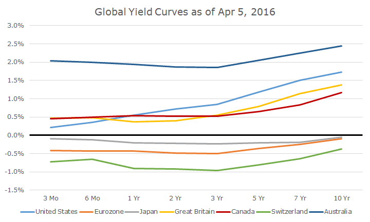
This chart is striking for at least three reasons. First, the overall level of rates is just appallingly low across the world. The idea that the highest rates are still a paltry 2.5 percent is troubling.
Second, and even more bothersome, is that three of the curves are negative all the way out to 10 years. There are other countries with negative yields like Denmark, but the idea that the euro benchmark curve is negative is striking.
There are a number of eurozone countries with positive yields like Spain (1.49 percent), Portugal (3.12 percent) and Greece (8.78 percent), but this curve is considered the benchmark.
Finally, there are only three ‘normal’ yield curves, where rates rise as the maturity goes out further into the future. The US has the steepest curve, although it’s far flatter now than it was six months ago.
But look at Australia where the three-month yield is higher than the three-year yield. Granted, the 10-year yield is higher than the three-year, but the rates at the front end should be lower.
Negative rates aren’t brand new – I first wrote about them in February (click here for the article) of last year and the term NIRP, which is short for ‘negative interest rate policy’ is now a common part of the vernacular.
Still, while it may not exactly be new, it’s still hard for me to wrap my head around.

David is a trusted advisor to 50 families, delivering comprehensive financial solutions, including financial planning, investment management, cash management, tax planning, estate planning, and charitable giving. As Chief Investment Officer, he leads the Investment Committee and the research and trading team. His team continuously evaluates investment strategies and securities, working closely with Portfolio Managers to implement them effectively.