When academics evaluate a strategy like value or momentum, they test the data in a variety of ways to make sure that the effect that they are studying is real and not spurious (to use their term for bogus).
When Rolf Banz first proposed the small cap effect in 1981 (the original study can be found here), he used US return data from 1936 to 1975. He used the data that was available to him in what is called an ‘in-sample’ study.
To check the robustness of his theory, other academics did ‘out-of-sample’ tests to see if the same effect, that small cap stocks tend to outperform large cap stocks, was universally true or specific to his in-sample study period.
At one point, the study was extended to 1926, which provided some out of sample data. Subsequent studies that evaluate results from 1980 through today are also considered out-of-sample because knowing about the size effect can have an impact on the effect itself.
Another important-out-of-sample test in finance is to see whether you can find an effect outside the U.S. If the small cap premium only works in the US and can’t be found elsewhere, it’s a pretty good bet that the effect isn’t real.
In that vein, Standard & Poor’s released a new iteration of their S&P Indexes vs. Active (SPIVA) report that evaluates how actively managed mutual funds compare to their benchmarks.
I’ve written about SPIVA in the past (click here for a refresher), but what makes this version interesting is that it is effectively an out-of-sample test because it looks at how European and British fund managers fair versus their benchmarks (no word on an Asian report). It may not be a new report, but I haven’t seen it before.
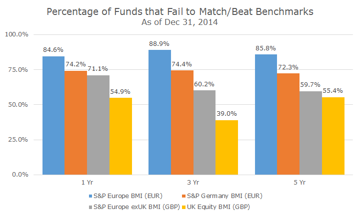
The evidence looks like it confirms what we see in the US, which is that the past five years have been tough for active managers. In the chart below, I picked two European and two British based categories compared to their indexes (as denoted by EUR for Europe and GBP for the UK). Here’s a link to the full report if you want to make sure that I’m not cherry-picking data.
When I look at the US SPIVA report, I tend to focus on the frequency and magnitude of the underperformance, so I thought I would do the same thing with the European data. This first chart depicts the percentage of funds that fail to either match or beat their benchmarks.
It appears that the European broad market index (that’s what BMI stands for) was very tough to beat with only 10-15 percent of managers winning over the past one, three and five years.
The Brits fared better both at home and on the continent. In the three year period, 61 percent of British fund managers beat the benchmark – the only showing where more than half of the fund managers beat the index.
Now, here’s where it gets interesting. I think the frequency data is worth looking at, but not compelling on its own because it could just be a signal that there are a lot of bad managers out there and all you need to do is find the good ones and you can easily beat the market.
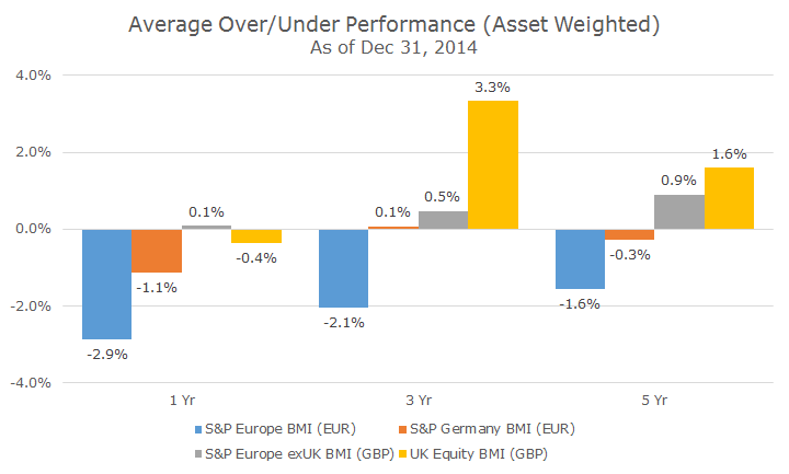
I like to look at the magnitude of the over or underperformance as well, which is what the chart below shows. We saw that the vast majority of European fund managers failed to match their index, but now we can see that it was a good sized miss across all time periods, between 1.6 and 2.9 percent per year.
If we jump head to those wily Brits, an interesting picture emerges. Remember in the three year period, 61 percent of fund managers beat the index. This chart shows that they beat the index by 3.3 percent per year on an asset weighted basis.
One measure (that I didn’t chart) treats all funds equally – it doesn’t matter if you are managing $1 million or $1 trillion dollars (or pounds, I suppose). I think the asset-weighted data is better because it seems more representative of how the money is actually invested. It kind of gets back to my point about the simple number of funds that win or lose.
That same idea can be seen in the five year numbers for the British fund managers buying UK stocks, because only 45 percent of them beat the benchmark, but when you look at the assets, they beat by 1.6 percent per year. You can see the same thing to a less extent in some of the other data as well, like the three-year S&P Europe exUK BMI (GBP), for example.
Looking at this data, I would say that the out-of-sample weakens the argument a little bit regarding actively managed funds and their relatively poor performance in the US over the past five years.
That said, I don’t think the relatively good performance of British fund managers is enough to change my view that actively managed funds don’t fare well compared to benchmarks over time.
I would say that it’s just enough data to keep the debate going and I’ll be on the lookout for data from Asia and more from the US, Europe and the UK as time passes.


